
This article was co-authored with generative AI. Facts have been checked against public documentation where feasible, but errors may remain. Please verify primary sources before relying on this for important decisions.
Background
After recovering vdiff.js from the Wayback Machine and placing it in static/vdiff/ on this site (earlier article), and then addressing the problem of Nuxt 2's generate crawler overwriting the mirror and retiring the old service worker (previous article), the service was back up.
Up to that point, the mirrored vdiff.js demo page was used as-is. However, the rest of the site is built on Vuetify, so there were a few things worth aligning:
- Match the visual design of other pages on the same site (header, Material-style colors, dark mode support, etc.)
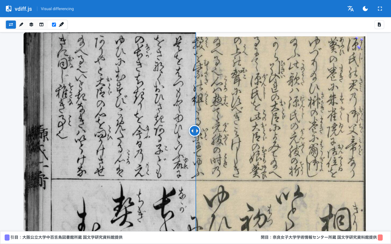
- Use the "side-by-side slider" mode as the default, since that is the most common use case on this site (collating manuscript copies)
- Keep the image legend footer visible on-screen at all times when a tall IIIF crop is supplied
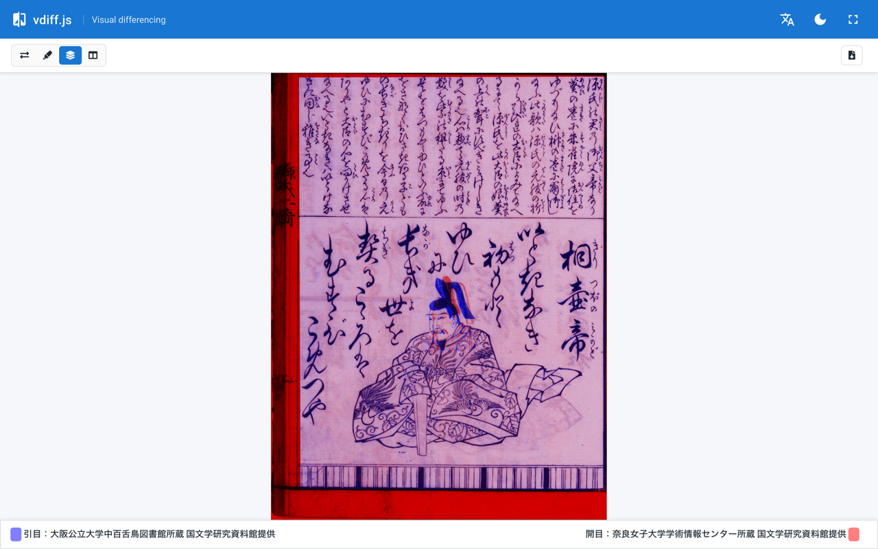
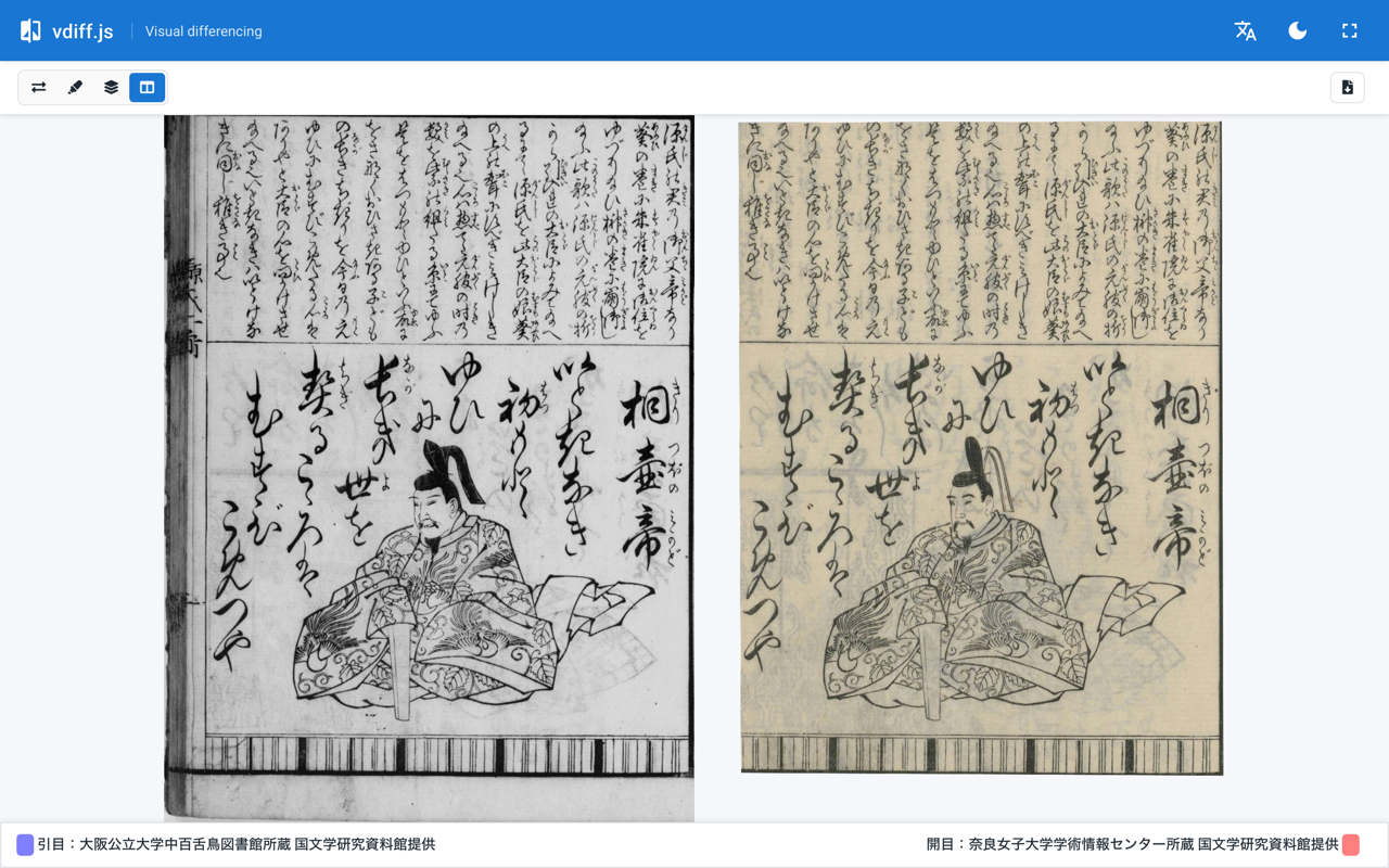
This post records how the outer wrapper was used to bring vdiff.js in line with the rest of the site's design with minimal changes to the core (compressed) bundle. The final result looks like this (side-by-side slider mode, desktop):
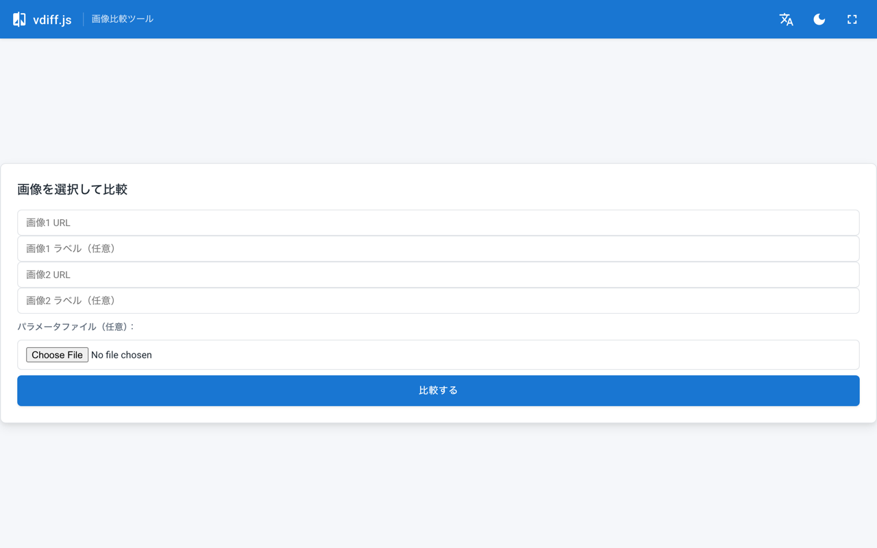
The form screen shown when opened without URL parameters:
Structure
The mirror directory structure at the end of the previous work:
static/vdiff/
├── index.html
├── vdiffjs/
│   ├── vdiff.bundle.css
│   └── vdiff.bundle.min.js
├── opencv/opencv-4.5.1.js
├── vdiffjs-wrapper.css
└── vdiffjs-wrapper.js
vdiff.bundle.min.js is the core (a jQuery UI-based library); vdiffjs-wrapper.js is the CODH-provided wrapper (handles initialization from URL parameters, editor mode switching, spinner display, etc.).
Two new files, vdiff-modern.css and vdiff-modern.js, were added on top, and index.html was replaced with a new layout. The core files were left untouched.
static/vdiff/
├── index.html              # Replaced
├── vdiff-modern.css        # Added
├── vdiff-modern.js         # Added
└── ...                     # Core files unchanged
Summary of Changes
- Added an app bar (Material-style, with language/theme/fullscreen toggles) at the top
- Laid out the original vdiff toolbar and legend to stick to the top and bottom edges (flex column + sticky)
- Applied
max-heightonly to the image container to keep the footer on-screen; overflow is handled byoverflow: hiddenon the container (no forced scaling) - Hidden UI elements with no current destination: edit button,
?help, headeri, CODH links - ja/en language switching, dark mode via
prefers-color-scheme+ explicit toggle - Switched the default comparison mode to "side-by-side slider" (one-byte patch on the bundle)
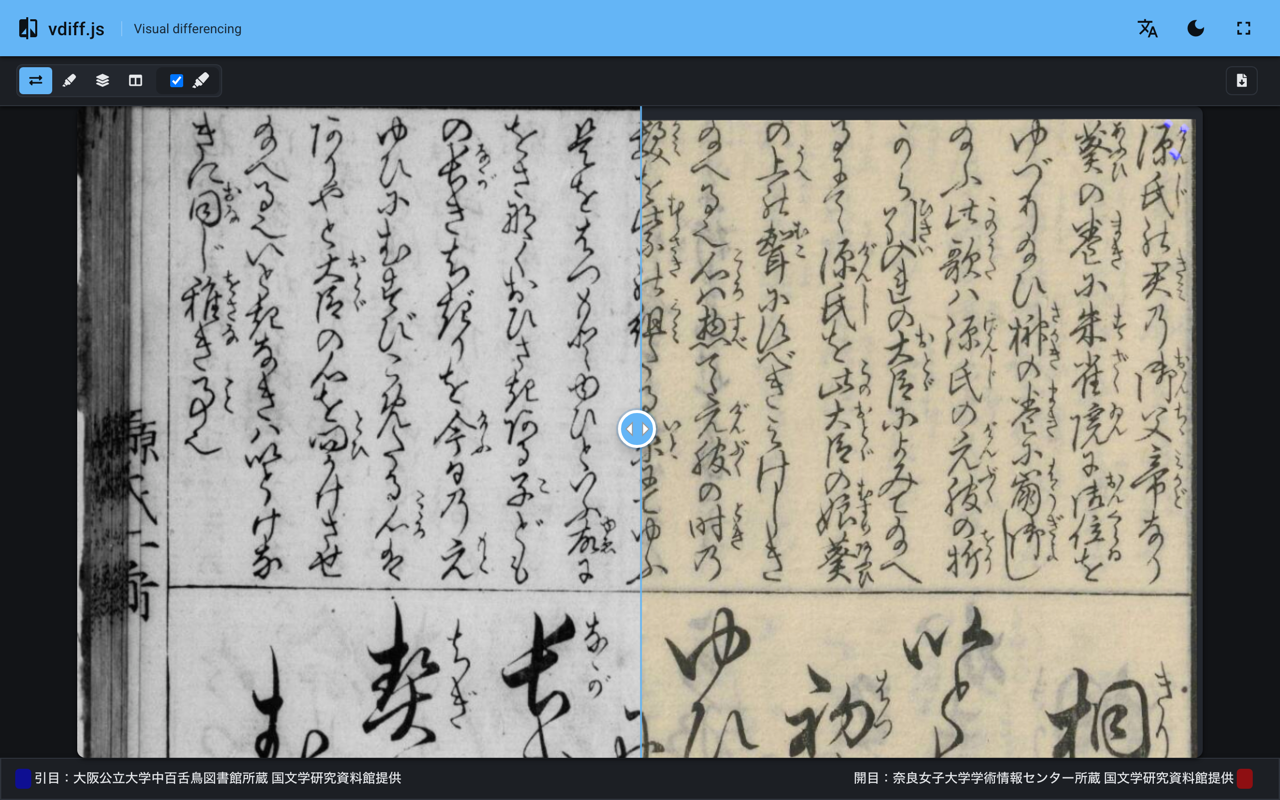
For reference, the dark mode appearance:
The next two sections cover the last two items in order.
Layout: flex column + max-height
The visible DOM generated by vdiff.js has roughly this structure:
.vdiffjs-container               ← flex column parent
├── .toolbar-container.top       ← mode selector, etc. (top edge)
├── canvas                       ← output for highlight/red-blue/etc. modes
├── .images-compare-container    ← container for side-by-side slider mode
└── .legend-container.bottom     ← "Image 1 / Image 2" legend (bottom edge)
A flex column is applied from outside while preserving the original CSS (inline-block containers, etc.):
.vdiff-modern .vdiffjs-container {
  display: flex;
  flex-direction: column;
  height: calc(100vh - var(--vm-appbar-h));
  overflow: hidden;
}

/* Top toolbar (full-width, sticky) */
.vdiff-modern .vdiffjs-container > .toolbar-container {
  position: sticky;
  top: 0;
  flex: 0 0 auto;
  margin: 0 !important;
}

/* Bottom legend (pushed down + sticky) */
.vdiff-modern .vdiffjs-container > .legend-container.bottom {
  margin-top: auto !important;
  position: sticky;
  bottom: 0;
  flex: 0 0 auto;
}

/* Center image area — overflow handled by container's overflow:hidden */
.vdiff-modern .vdiffjs-container > .images-compare-container {
  align-self: center;
  flex: 0 1 auto;
  min-height: 0;
  margin-top: auto !important;
  margin-bottom: auto !important;
  max-height: calc(
    100vh - var(--vm-appbar-h) - var(--vm-toolbar-h) - var(--vm-legend-h)
  ) !important;
  max-width: 100vw !important;
}
The key is pairing flex: 0 1 auto; with min-height: 0;. Without min-height: 0, a flex child cannot shrink below its content size, so a tall IIIF crop pushes the legend-container outside the viewport (the classic "footer disappears" issue).
The bottom of an oversized image gets clipped by the container's
overflow: hidden, but trying to force-scale everything into view means fighting the library indefinitely. Keeping the footer visible is the priority; image clipping at the bottom is acceptable.
Hiding Unused UI
Since the CODH site is down, buttons that point there are hidden. Additionally, there are auxiliary setting panels that JS sets to visibility: hidden depending on the selected mode, leaving empty space — these are forced to display: none.
/* Edit button (editor mode not used) */
.vdiff-modern [id$="-editor_link"] { display: none !important; }

/* Help "?" and external link (to CODH) */
.vdiff-modern .vdiffjs-container .ui-button:has(.fa-question),
.vdiff-modern .vdiffjs-container .ui-button:has(.fa-external-link-alt) {
  display: none !important;
}

/* Collapse auxiliary panels hidden by visibility:hidden */
.vdiff-modern .compare-methods-additional-setting-container[style*="visibility: hidden"],
.vdiff-modern .compare-methods-additional-setting-container[style*="visibility:hidden"] {
  display: none !important;
}
The attribute selector [style*="visibility: hidden"] matches both the space and no-space variants because the library sets el.style.visibility = 'hidden' internally, which typically produces style="visibility: hidden;" (with a space), but both patterns are covered for safety.
Switching the Default Mode to Side-by-Side Slider
This is the main topic.
Step 1: Clicking the Radio Button via JS at Startup (Failed)
The comparison modes in vdiff.js are controlled by a radio group at the top (IDs radio0 through radio3), with radio1 (highlight) checked at startup. The initial approach was simply to switch the radio after startup.
// vdiff-modern.js (naive version — did not work)
function applyDefaultView() {
  if (sliderApplied) return
  const sliderInput = document.querySelector(
    '.compare-methods-selecter-container input[type="radio"][value="0"]'
  )
  if (!sliderInput || sliderInput.checked) return
  // Wait for canvas to appear
  if (
    !document.querySelector('.vdiffjs-container > canvas')?.offsetHeight
  )
    return
  window.jQuery(sliderInput).click() // jQuery UI checkboxradio pipeline
  sliderApplied = true
}
Observing the active mode every 200 ms with Playwright showed the mode switching to slider initially, but reverting to highlight around 800 ms later:
t=    0ms: Juxtapose          ← slider
t=  200ms: Juxtapose
t=  400ms: Juxtapose
t=  600ms: Juxtapose
t=  800ms: Highlight          ← vdiff initialization runs, resets to highlight
t= 1000ms: Highlight
...
The vdiff wrapper has logic that ultimately sets radio1 to prop('checked', true) after async image loading, overwriting the earlier click.
A retry-until-user-acts approach (forcing slider until the user actively clicks another mode, giving up after 10 seconds) technically worked, but the flash on startup could not be eliminated. Even with a MutationObserver, the library's final set comes at an unexpectedly late point.
Step 2: One-Byte Rewrite of the Minified Bundle
The straightforward answer is to change the initial value in the library itself. Grepping vdiff.bundle.min.js reveals that the comparison mode initialization looks roughly like this in the surrounding area:
// Variable names are minified
ut = jt('<div>').addClass('compare-methods-selecter-container'),
p = e + 'radio',
ct = U + ' input[name="' + p + '"]',
Pt = G ? 3 : 4,            // Number of modes (3 if G is truthy, 4 otherwise)
Ot = G ? 0 : 1,            // ★ Default mode index (highlight = 1)
kt = (0 < t && t <= Pt && (Ot = t - 1), [])  // Argument t can override
In other words: Ot is the default mode index; if G is truthy it is 0, otherwise 1 (highlight). An argument t in the range 1–Pt overrides it with t-1. There is an external override path via t, but the mapping from config key to t is obscured by minification and hard to trace.
On the other hand, Ot=G?0:1 appears exactly once in the file, making a pinpoint replacement the safest approach.
# One-byte patch
import sys
p = 'static/vdiff/vdiffjs/vdiff.bundle.min.js'
with open(p, 'rb') as f:
    data = f.read()
needle = b'Ot=G?0:1'
assert data.count(needle) == 1, 'pattern is not unique anymore'
with open(p, 'wb') as f:
    f.write(data.replace(needle, b'Ot=G?0:0'))
This makes Ot=0 regardless of whether G is truthy or falsy, setting the initial selection to the side-by-side slider (value=0).
What
Gactually means is impossible to trace in minified code, but fromPt = G ? 3 : 4(number of modes), it is likely a flag for a compact variant with editor mode or some features disabled, where index 0 also maps to the side-by-side slider. SoOt=G?0:0is safe in both branches (matches the existing behavior of theG=truebranch).
Re-running the Playwright observation shows the mode staying at Juxtapose (side-by-side) for the full 12 seconds, with no conflict from initialization:
t=    0ms: none              ← selector not yet rendered
t=  200ms: Juxtapose
t=  400ms: Juxtapose
...
t=11800ms: Juxtapose         ← stable throughout
The applyDefaultView retry logic and user-action detection were removed entirely.
The other modes — highlight, red-blue, and parallel — are still accessible via the icon group at the left of the toolbar. The overall layout approach (top and bottom edges fixed) works consistently across all modes.
Notes on Patching a Bundle
vdiff.bundle.min.jsis a third-party artifact from CODH. If you distribute a patched version on a public site, follow the license (vdiff.js is MIT) and note that it has been modified. At a minimum, mention the patch ("one-byte patch:Ot=G?0:1→Ot=G?0:0") in the commit message, and consider placing a NOTICE-style file understatic/vdiff/so you do not confuse yourself later.- Every time upstream changes are pulled in, the patch needs to be reapplied. Keep the steps in a shell script or Makefile target to avoid accidents.
- Because the file is minified, identifier names (
Ot,G) may change if the minifier version changes. Theassert data.count(needle) == 1check on the match count is important.
Responsive Support
Testing the implementation on a smartphone with the IIIF crops commonly used on this site (natural width roughly 600–1200 px) revealed two issues:
- Images wider than the viewport overflow horizontally, cutting off the right side
- When long Japanese legend labels wrap to 2–3 lines, the fixed
--vm-legend-h: 40pxused in themax-heightcalculation causes the image area to ignore the actual legend height, pushing the legend off-screen or destabilizing the layout
The following three steps address these in order.
1. Hand Full Layout Control to flex Expansion/Contraction
The initial approach of computing max-height: calc(...) using fixed CSS variables for toolbar and legend heights breaks when the legend wraps dynamically. Instead, drop all fixed-pixel calculations:
.vdiff-modern .vdiffjs-container {
  display: flex;
  flex-direction: column;
  height: calc(100vh - var(--vm-appbar-h));
  height: calc(100dvh - var(--vm-appbar-h));  /* iOS Safari support */
  overflow: hidden;
}
.vdiff-modern .vdiffjs-container > .toolbar-container,
.vdiff-modern .vdiffjs-container > .legend-container.bottom {
  flex: 0 0 auto;            /* Stick to edges at natural size */
}
.vdiff-modern .vdiffjs-container > .images-compare-container {
  flex: 1 1 auto;            /* Take all remaining space */
  min-height: 0;
  max-height: 100%;
  max-width: 100%;
}
flex: 1 1 auto; min-height: 0; is a critical pair — without min-height: 0, a flex child cannot shrink below its content size, so a large natural-sized image pushes the legend out of the viewport.
The 100vh / 100dvh double declaration is a progressive fallback: older browsers that do not support dvh (dynamic viewport height) use the former, while supporting browsers use the latter. On iOS Safari, the address bar resizes dynamically, so 100vh tends to clip the bottom when the address bar is visible; 100dvh is the better choice.
2. Slim Down the App Bar and Legend on Mobile
Via media query:
@media (max-width: 600px) {
  :root { --vm-appbar-h: 48px; }                     /* 56 → 48 */
  .vdiff-modern__appbar  { padding: 0 8px; }
  .vdiff-modern__icon-btn { width: 36px; height: 36px; }
  .vdiff-modern__icon-btn .material-icons { font-size: 20px; }
  .vdiff-modern .vdiffjs-container > .legend-container {
    padding: 6px 8px !important;
    font-size: 11px;
  }
}
Even at 11px font, attribution text like "Hikimenote: Osaka Metropolitan University Nakamozu Library, provided by the National Institute of Japanese Literature" still wraps to 2–3 lines. That is acceptable — the key is that with flex-based layout, the image area simply adjusts to accommodate whatever height the legend takes.
3. Re-request IIIF URLs at Viewport Size
Horizontal overflow cannot be fundamentally solved with CSS alone. jquery-images-compare sizes its container based on the image's natural dimensions; forcing max-width: 100% does not change the natural 600 px width of the <img>, so the container's overflow: hidden just cuts off the right half.
If the images being served are from a IIIF Image API, this can be solved cleanly. Rewriting the size segment to match the viewport before requesting the image means the natural size is optimal from the start, and neither the library nor the CSS needs to fight anything.
<!-- index.html — immediately before the VDiffWrapper IIFE -->
<script>
  (function rewriteIiifSize() {
    var url = new URL(location.href);
    var dpr = Math.min(window.devicePixelRatio || 1, 2);
    var w = Math.round(window.innerWidth * dpr);
    var h = Math.round(window.innerHeight * dpr);
    var sizeSeg = '!' + w + ',' + h;             // !w,h = fit within this rectangle, preserving aspect ratio
    var qualityRe = /^(default|color|gray|bitonal)\.(jpg|jpeg|png|tif|tiff|gif|webp)$/i;
    var rotationRe = /^!?\d+(\.\d+)?$/;
    var changed = false;
    ['img1', 'img2'].forEach(function(key) {
      var v = url.searchParams.get(key);
      if (!v) return;
      var parts = v.split('/');
      if (parts.length < 5) return;
      // Detect IIIF Image API URL by the pattern of the last two segments
      if (!qualityRe.test(parts[parts.length - 1])) return;
      if (!rotationRe.test(parts[parts.length - 2])) return;
      if (parts[parts.length - 3] === sizeSeg) return;
      parts[parts.length - 3] = sizeSeg;
      url.searchParams.set(key, parts.join('/'));
      changed = true;
    });
    if (changed) history.replaceState(null, document.title, url.toString());
  })();
</script>
Key points:
- Only rewrite when the last two segments (
<rotation>/<quality>.<format>) match IIIF patterns; non-IIIF URLs (plain.png, etc.) are left alone - The IIIF size
!w,hsyntax returns an image that fits within thew×hrectangle while preserving aspect ratio — exactly what is needed here - DPR is capped at 2; requesting 3000+ px images on a 3× flagship device can trigger IIIF server size limits and return a 400 error
- The
parts[parts.length - 3] === sizeSegcheck prevents double-rewriting on reload - Using
history.replaceStateto update the URL means users who copy the address bar get a URL with the optimized size already baked in. The original600,/specification is lost, but the recipient's browser will rewrite it again to fit their own viewport
After the rewrite, Playwright measurements across viewports:
viewport 1280×800 desktop  : compare=1126×652, legend 42px (1 line), all elements fit
viewport 390×844  iPhone 13: compare=390×664,  legend 82px (2 lines), all elements fit
viewport 375×667  iPhone SE: compare=375×467,  legend 102px (3 lines), all elements fit
The image container fits the viewport width precisely, and the legend can wrap to any number of lines without being pushed off-screen.
Language Switching, Theme, and Fullscreen
These are straightforward DOM operations.
<header class="vdiff-modern__appbar">
  <span class="vdiff-modern__subtitle"
        data-ja="画像比較ツール"
        data-en="Visual differencing">画像比較ツール</span>
  <button id="vdiff-modern-lang">…</button>
  <button id="vdiff-modern-theme">…</button>
  <button id="vdiff-modern-fullscreen">…</button>
</header>
function applyLocale() {
  const lang = currentLang() // ?lang=ja|en or navigator.language
  document.documentElement.setAttribute('lang', lang)
  document.querySelectorAll('[data-ja][data-en]').forEach((el) => {
    el.textContent = el.getAttribute('data-' + lang)
  })
}
vdiff itself respects the ?lang=ja|en query parameter, so clicking the language button rewrites the query and reloads the page. A full SPA-style switch is not needed; this is sufficient.
Dark mode is implemented by switching CSS variables based on prefers-color-scheme, with a toggle button that sets data-theme="dark" and saves the preference to localStorage. Fullscreen calls requestFullscreen() directly.
Summary
- When customizing vdiff.js's UI from the outside, start with wrapper CSS/JS that avoids touching the core
- However, behaviors deeply embedded in the startup sequence — such as changing a default — are prone to flickering and reverting when driven from outside via DOM manipulation, due to conflicts with initialization
- When the change can be uniquely identified as a string in the file, a pinpoint byte replacement in the minified bundle is often the cleaner solution
- When committing a patch, assert that the match count is exactly 1 before applying, ideally combined with a hash check
- Accepting a UI trade-off like "clip the image rather than force-scaling everything, as long as the footer stays on-screen" can dramatically reduce maintenance cost compared to fighting the library
- For mobile, relying on flex expansion/contraction instead of fixed-pixel calc expressions — and, where possible, fetching images at viewport-appropriate sizes via IIIF or similar server-side sizing — tends to produce the simplest combination of CSS and JS in the end
References
- Recovering CODH's vdiff.js from the Wayback Machine to temporarily restore the "page-flip face comparison" for Digital Genji
- Nuxt 2 generate overwriting embedded apps under
static/with 404 pages, and retiring the old service worker - Setting up a dedicated temporary mirror repository for CODH tools on GitHub Pages
- jQuery UI checkboxradio Widget
Comments
…